But I thought I would share the evolution of one of the figures that went into the poster.
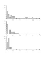
First thing I do is just plot the raw data, shown below. This is just for myself, not for presentation (besides this "behind the scenes" post in my blog, naturally), which is why it looks pretty poor. I don't like the bars in red stripes.
This is a useful step just to get a sense of what you've got, and sometimes helps detect errors. I found one of my students misplaced a decimal this way, so one of his data points was out by a factor of ten, which wasn't good. But we caught it.

That's the data from one experimental treatment. Now I want to see all the experimental treatments side by side. This one I was thinking I might end up using in a presentation at some point, so I cleaned it up a little more.

The good news is that it looks like there might be an effect. The bad news is, that from looking at the plot above, the data are not normally distributed -- most are piled up over on the left hand side -- and they differ in how much they vary. Both of these things are bad statistically.
The plot below shows how I transformed the data to try to fix those issues.

Not perfect, but certainly not as skewed toward the right as before. Again, this is just for my own exploration, so it's just the default red stripes. I could change the default, but I've been too lazy.
The next step is to run some stats. Here, I have to switch to a real stats program, which does all the test right -- but leaves a lot to be desired in terms of graphs.

The above was the default plot of averages I got when I ran the statistical test -- which confirmed that there was a significant effect! Still, the plot leaves much to be desired. I want the data points in different order, and I don't want them joined by lines, and I want to show some measure of the variation.
The stats program gave me this when I asked it to show mean and standard error.

Still not great. And the above two pictures are both screen grabs. I want an image in a form that will scale up and not get all jaggy when I put in on a big poster. The WMF format scales up, but when I try to export the graph in WMF, I get this:

Proof that the stats software is about the numbers, not the pictures.
So now I go back to my graphing program. I try using it to plot averages and error bars, and get a a basic bar graph.

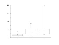
Not bad, but because one of the issues with this was initially the skew and variation, I want something that might show a little more detail than that. I try a box plot of the raw (i.e., non-transformed) data.

Getting closer now, but the fiddling over details gets more intense. The lines are too thin for a poster, so I thicken them. The little square in the middle, which shows the average, tends to get lost when I thicken the lines; I turn that into a diamond to make it more distinct. The top and bottom whiskers are supposed to represent the 95% confidence intervals, but the sample size is small enough that it ends up being in the same position as the minimum and maximum, which are shown as the top and bottom Xs. So I get rid of the Xs while I'm at it.

Now I also want to show the transformed data, so I make a similar plot and change it much like I changed the graph of the raw data.

I add the letters above each box to show which condition is statistically different from the others. (Boxes that have the same letter above them do not differ.) But the plotting program doesn't allow me to line up the letters as precisely to the boxes as I want, so I import that into a real graphics program for final tweaking.

And that's the end result on the poster!
To make this one figure, I used four different software packages. Microsoft Excel 2003 for data manipulation, Origin 7 for graphing, SPSS 12 for statistics, and CorelDRAW 12 for final touch-up. I'm showing almost a dozen graphs, although there are a few more steps in the process that I didn't show here.
And this is the easy figure on the poster.

No comments:
Post a Comment
Comments are moderated. Real names and pseudonyms are welcome. Anonymous comments are not and will be removed.