I have been preparing for my talk at the University of Texas San Antonio this week. For context and background, I wanted to include some graphs from other, previously published papers as well as my own stuff. There were two problems.
First, the quality of the graphs I wanted to use wasn’t always there. Many were old, pixelated images. Some graphs had unlabelled error bars, and some had text overlapping with error bars. Some bar graphs had hatching to distinguish the bars that was not very pleasing to look at.
Second, the style of the images I wanted to use varied wildly. Some were monochrome, some used colour. Some used serif types, some used sans serif type. The shape of the graphs sometimes didn’t come anywhere near the shape of the slide.
Even with my own material, I was pulling together images from several years and projects – manuscripts, conference posters, unpublished stuff – and I was painfully aware that it didn’t fit together very well. As I’ve written about before, consistency matters.
So I redrew everything.
With my own material, this was tedious but straightforward. I just had to locate a lot of archived files on my hard drive, opened them up, and started changing fonts, colours, and proportions.
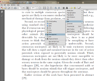
 Making other people’s stuff consistent can be trickier. First, I typically had to grab images. For PDF files, there is a snapshot tool in Adobe Reader that lets you do grabs of anything on the screen. It isn’t turned on in the toolbar by default, though. Click at right to enlarge.
Once I have a grab of the graphic, I can then put it into a full graphics editor (I’m a Corel Photo-Paint user myself; other software packages are available). For instance, I can get rid of text that I don’t need or remove the background. But even PowerPoint can do some basic manipulations quite well.
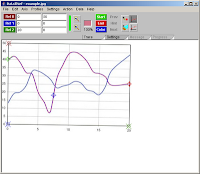
 For some graphs, I need to go right back to ground zero and redraw the graph in my own software. There is a shareware program called Datathief that I’ve used to get extract information from published graphs so I can replot it. It’s fairly simple to use for distinct data points, like scatter plots or bar charts. I haven’t tried to extract a curve yet.
I have heard that data extraction from published graphs is possible in Matlab, though I haven’t done it myself.
In the end, almost every image in my presentation has been altered, tweaked, cropped, redrawn, recoloured, resized, or revised. It took a few solid days to do it. I am convinced it’s worth it, though. The level of harmony in the talk is so much higher, and the overall effect of the presentation is so much stronger, than if I had just left it looking like a scrappy quilt.
Related posts
The Zen of Presentations, Part 41: Consistency

For Mac users, check out Graphclick - it can even suck in whole curves for quick and easy replotting. I use it all the time both for this and meta-analyses.
ReplyDelete