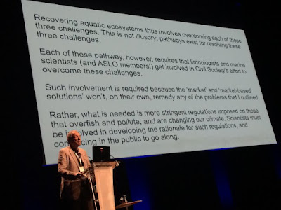
Recently I spotted this conference slide shared on Twitter.
A slide with no visuals, just a wide screen of four paragraphs of text.
I thought we had all agreed not to do these any more?
At first I thought this was just crazy, but then I realized there might (and I stress might) be a something else at play here: social media. Typically, a good slide for a presentation is visual and had minimal text. The speaker provides the words, not the slide.
But a disadvantage of slides that are well designed for the audience is that they don’t make much sense without the speaker. They lack context. They aren’t portable.
This slide is the conference equivalent of someone taking screenshots of newspaper articles to get around Twitter’s character limits. Sure, the slide sucks for the audience in the room, but it’s great if you share it on Twitter, since the slide leaves no doubt exactly what the person’s point is.
I’m now very nervous that we’re going to start seeing conference slides backsliding into the old bad habits of “death by PowerPoint¨ with huge blocks of text that people will read, word for word, with the excuse being that “more people will share it on socials.”
Please make your slides for the audience in the room with you. It’s respectful. You want to share something on social media? Design something specifically for Twitter or INstagram or Bluesky or whatever.


No comments:
Post a Comment
Comments are moderated. Real names and pseudonyms are welcome. Anonymous comments are not and will be removed.