A slide with no visuals, just a wide screen of four paragraphs of text.
I thought we had all agreed not to do these any more?
At first I thought this was just crazy, but then I realized there might (and I stress might) be a something else at play here: social media. Typically, a good slide for a presentation is visual and had minimal text. The speaker provides the words, not the slide.
But a disadvantage of slides that are well designed for the audience is that they don’t make much sense without the speaker. They lack context. They aren’t portable.
This slide is the conference equivalent of someone taking screenshots of newspaper articles to get around Twitter’s character limits. Sure, the slide sucks for the audience in the room, but it’s great if you share it on Twitter, since the slide leaves no doubt exactly what the person’s point is.
I’m now very nervous that we’re going to start seeing conference slides backsliding into the old bad habits of “death by PowerPoint¨ with huge blocks of text that people will read, word for word, with the excuse being that “more people will share it on socials.”
Please make your slides for the audience in the room with you. It’s respectful. You want to share something on social media? Design something specifically for Twitter or INstagram or Bluesky or whatever.
Last week, I gave a live online presentation for Plant Biology and watched a lot of recorded presentations at the Animal Behavior Society virtual meeting. Based on those experiences, here are some suggestions for how to crush your next Zoom presentation.
1. Don’t use the keyboard to advance slides. Many presenters are recording themselves talking with their device's built in microphone. These mics are very sensitive to sound transmitted through the computer, like keystrokes. I heard many presentations where audible “ka-thunk” sounds punctuated the talk every time a slide advanced. It is both distracting and can obscure what the presenter is saying.
If you must use a keyboard for some reason, use the lightest tough possible. But using a mouse or setting up your slides to auto advance is much better.
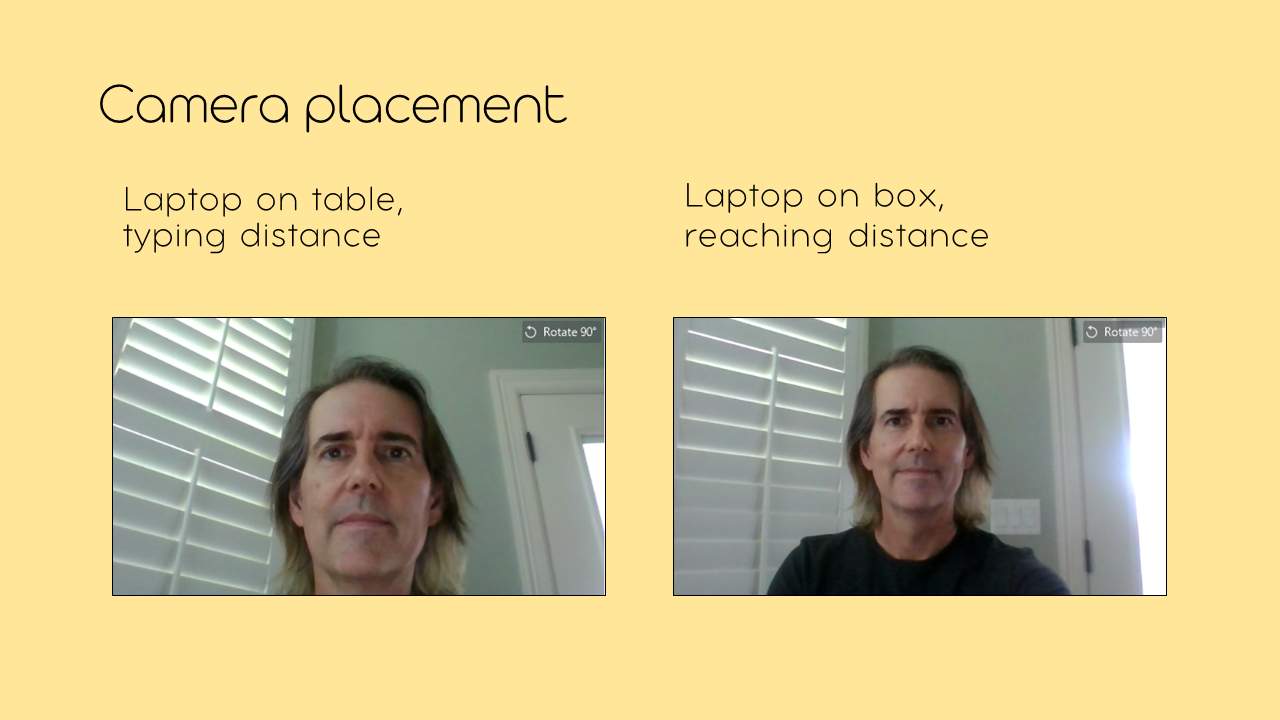
2. Place your camera carefully. Most laptop cameras are wide angle and are placed so low that viewers seeing your ceiling more than you. Some people are so close, or the camera is so poorly positioned, that viewers can’t even see all of the face. You get better images by placing a laptop on a couple of thick books (textbooks are about the right height) or a thin cardboard box, and pushing it back further from you than your usual typing distance. (When you’re the featured speaker in a Zoom presentation, you shouldn’t be typing anyway.)
3. Look at the camera, not the screen – especially when presenting. Humans are insanely good at judging where other people are looking. To create that sense of personal connection, you want people to feel like you are looking straight at them. You can’t get the when you are looking down at the other participants’ images.
My laptop has a little light that comes on when the camera is recording, so I just look at the light. If your camera does not light up, put a sticky note next to the camera with a note that says, “Look here!”
4. Keep your energy levels up. There are so many distractions when people are online. A low key, “drawn people in” approach can be very effective in person, but will probably fail in an online setting. You need to be one step shy of bouncing off the walls to keep viewers watching you and not checking their email.
5. Gesture beside your head, not in front of it. Cameras love movement. Zoom is a visual medium, like television. But unlike television, webcams in computers are (as mentioned) very wide-angle, and anything that approaches the camera – like your hands – shows up huge, like looking through a door security lens. You don’t want your fingertips bigger than your face.
If you want to use your hands for emphasis, which is a good idea, raise them up by the side of your face so that they look the right size. This can feel weird at first, but with a bit of practice, brings a lot of visual interest to a presentation.
(I think I might have first heard this tip from Carin Bondar.)
6. Make a custom Zoom background. This is what slides in my PowerPoint deck looked like:
Blues and whites. Hand-written font (Ready for Anything from Blambot) for headings and Corbel font for body.
I made a Zoom background specifically for the presentation, using the same colours and fonts, and added my Twitter handle and conference hashtag. (In retrospect, the hashtag might be a bit bigger.) It is just a nice touch to tie everything together.
I got quite a few new followers after the talk, so maybe the background helped. I had my Twitter handle on my first and last slides, too, so hard to say what was most effective.
If you do this, remember you will be roughly in the center and any video of other speakers will most likely be on the right. A background with the focal point right in the middle is kind of a waste, because your face will cover it.
7. Wear headphones. I am surprised that after so many months, I am still hearing feedback and audio howlaround from people in a Zoom meeting not wearing headphones. If you are not wearing headphones, the computer plays the sound through the speakers, which is picked up by your mic, broadcast to the meeting, then played through your speakers and picked up by the mic again. If you are the only one speaking and nobody will ask you questions, this might not happen. But if you’re not taking questions, why are you having a Zoom meeting instead of recording a YouTube video?
If it’s just a regular old meeting, you probably
don’t need to take these steps. But if you are the invited speaker at a
conference, you want to class it up and do more than the bare minimum.
At any given moment in time, there are people who are well known for giving good presentations.
In the early part of the twenty-first century, many people pointed to Steve Jobs as an example of what a great presenter could do. In her book Resonate Nancy Duarte says, “Jobs had the uncanny ability to make audience engagement appear simple and natural.” She points to the iPhone launch in 2007 as one of the best product launches of all time.
I often pointed to Hans Rosling, who leapt into people’s awareness with some of the first TED talks in 2006. Indeed, Rosling practically provided the templatefor what a TED talk was. Others followed in his footsteps for years to come.
But we lost Jobs in 2011, and Rosling in 2017.
But now I would like to nominate the person who is, I think, one of the best presenters of this time.
Hasan Minhaj.
You might object that Minhaj is a stand-up comedian, and stand up isn’t really a presentation in the usual sense. That’s certainly what I might have thought when I had only seen him on The Daily Show. Funny, yes. But a great presenter?
But then I saw his special Homecoming King. It’s stand up, but like many one person shows, there’s a strong narrative running though it. It mostly revolves around a prom date gone wrong.
But it’s not just Minhaj on a stage. He has a screen that shows a lot of images that are relevant to what he is describing. In other words, his Peabody Award winning special is a PowerPoint presentation. A high end and heavily disguised PowerPoint presentation, but it’s not such a different beast than many.
His Netflix series Patriot Act is less personal but more topical, and Minhaj pushes his presentation skills even further. In each episode, Minhaj does a deep explanation of one or two subjects. In science communication terms, Minhaj is making “explainers.”
And these are data driven episodes on somewhat esoteric subjects. You don’t see a lot of coverage of the Indian general elections in the news on North America.
Chinese censors, street wear hype, drug pricing, and affirmative action all come under the microscope. (In light of the university admissions scandal that broke last week, the first episode about university admissions is worth a watch, too, as Minaj lays out the the background for the lawsuit against Harvard about admissions that is being backed by white guys trying to destroy affirmative action.)
Patriot Act the only show I can think of that wouldn’t surprise me if it did an entire episode about Plan S and academic publishing.
Why I think Minhaj’s presentation is the best around right now?
Obviously, Minhaj is legit funny. But he isn’t afraid to tell niche joke. In one episode, he says something like, “I tell jokes for four people at a time.”
Minhaj’s show is committed to evidence and data. Minhaj says he has a team of researchers that help him look smart, but most shows wouldn’t bother. Most comedy shows would just be content to have their comedian mouth off whatever thoughts they have, maybe with some light fact checking. But Minhaj is not just expressing opinions. He’s building arguments.
Minhaj is concise, and has the ability to sum up complicated backstory in a few short, well-chosen sentence. Almost accidentally, this makes him fast. I sometimes think an episode of his show would almost be one of the best “Intro to political science”lectures on any campus, but then I realize that it would be too quick for students to take notes. But you’re not taking notes, so it doesn’t matter. You can just enjoy the delivery and flow.
And Patriot Act is filmed in front of an audience. While his monologues are obviously incredibly tightly scripted, Minhaj still pays attention to his audience. He goes off script for a few seconds to responds to them and interact with them.
While I said Minhaj’s lectures wouldn’t be too effective for students trying to take notes, I will be taking notes: not on the content, but to figure out what makes his presentations so good.
In grad school, I was introduced to a nice, simple rule for giving a talk.
One slide per minute.
I used this rule for a long time. It seemed to work well. In particular, any slide with data seemed to take at least a minute to digest. You had to orient yourself to the axis labels, the units, there is reader an interpretation to do, and that takes a little time.
I did know it was a rule of thumb, not an ironclad rule. I would estimate a slide would be up for a little less than a minute when it was a picture of an animal or something else that had no data or nothing to read.
But then I saw Lawrence Lessig’s presentation, “Free culture” (via Garr Reynolds’s blog). His talk had 243 slides, but it was not 243 minutes. Lessig used his slides in a way I’d never seen before. They weren’t illustrations to be described or explained. His slides were his rhythm section, laying out a beat and emphasizing what he said. Even though his slides were up for such a short time, I never felt confused or lost or thinking, “Wait, wait, go back!”
I was blown away. I showed me how limited my views about what a “good presentation” were.
Then I learned about formats like pecha kucha and Ignite talks. Like Lessig, they emphasized quick pacing, running through slides at 3 to 4 per minutes. And those talks often rocked.
The key to such rapid fire delivery was planning and practice. The automatic slide advance rule for pecha kucha and Ignite talks forced to you plan and practice relentlessly. Practice never leads you wrong.
There are some images and slides that probably do warrant a full minute. But the audience can often pick up on points faster than you’d think.
There isn’t any magic number of slides in a talk. Your talk can have hundreds of slides. Your talk can have no slides. Or your talk can even have one slide per minute.
Update, 3 December 2021: Lawrence Lessig’s free culture talk was originally presented as a Flash animation, which is mostly dead now.
If you set things up and present your logic at every step, the audience can tell where things are headed without being explicitly told in advance.
Over on Better Posters, I’ve talked a lot about the Columbo principle. Columbo taught us that even when the audience knows the answer, the fun can be in learning how you prove it. I think that advice works well for titles, but it still implies a sort of “mystery” aspect that Nitenbach is criticizing.
But you can structure a talk where you tell the audience what’s going to happen, but not leave them disappointed.
When making Star Trek II: The Wrath of Khan, writer Nicholas Meyer (who also directed) was faced with a problem: Spock, the show’s most popular character, was going to die.
Actor Leonard Nimoy was bored with the part, not interested in doing another movie, and was sort of lured back in by the prospect of killing off the character. Fans learned about this, and were upset. Meyer got death threats. So what did Meyer do?
He killed Spock in the opening scene.
Of course, Spock doesn’t actually die at that point. He pretends to die as part of the Kobayushi Maru training scenario. So when the film is winding up for the actual, powerful death scene of Spock, people were not thinking about, “This is the one where Spock dies!”
Meyer said he learned on this movie that you can show an audience anything in the first ten minutes of a movie, and they will forget about it by the end of the movie.
You can do the same thing in a talk. You can tell people right at the start of a talk what you found. If you involve them, and make the narrative of that process well told, you can bring people through to the end, and they will think, “Oh yeah, I already knew that!”
The question is not whether you kill him. It’s whether you kill him
well. If it’s perceived as a working out of a clause in a star’s
contract, then they’re gonna hate it. If it’s organic, if it’s really
part of the story, then no one’s gonna object.
Or, to paraphrase Anton Chekov, if you want fire a gun in the third act, load it in the first act. The audience will forget the gun was even loaded until that final climactic shot.
One of the best treats over this past holiday season was the debut of Trollhunters on Netflix. This animated series, co-created by filmmaker and monster nerd Guillermo del Toro, is fantastic on all counts.
Early on, the lead, Jim, is given some atypical combat advice from his troll mentor, Blinky. In fact, it’s the first fighting rule for a trollhunter.*
Always be afraid. Fear heightens your senses. Fear keeps you alive. Arrogance gets you killed.
I’m not afraid to give a talk. And that’s currently one of my biggest problems as a presenter: I’ve done presentations too much.
When I first started giving talks at conferences as a grad student, when I got up to the lectern, I was wired. And it was not entirely positive energy arising the excitement of sharing what I had found. No, part of it was nerves because I was afraid.
Fortunately, I was able to take that energy and use it to make the delivery more enthusiastic and animated. A lot of people who have seen me talk have used that word, “energy,” in describing my style. It worked out because I was prepared, I knew what I wanted to say, and knew what my slides were. I was nervous, but not paralyzed by nervousness.
But even as I moved through grad school, and I racked up the presentations about my thesis research, I realized that I wasn’t feeling that rush of nervous energy just before I got ready to deliver my talk.
The problem was not so much arrogance as complacency. You reach a point in developing your writing and presentation skills where you know that you can give a talk without huge preparation, and it will be reasonable. You won’t stink up the room.
Writer Alan Moore put it this way in this interview:
With the America’s Best Comics that I’ve been doing... not even a half-arsed, it’s a quarter arsed idea at best(.) “Yeah, that’ll be good, let’s have some three-eyed cowboys. I’ve got no idea what they’re going to do in the story, but this issue’s all about three-eyed cowboys.” I mean, you might think of a story that’s got three-eyed cowboys in it and hope it comes to some sort of resolution, but it always does.
I’ve been working for 25 years now and I can probably bring near enough any story to a satisfactory resolution just because I’ve been doing this every day for 25 years – you get more confident in your ability to bring a story home.
I knew that energy was important to my presentations, and had been important in reaching the audience when I talked. So I deliberately tried to make myself nervous before talks. Nervousness is a kind of energy, and I had done enough talks that I knew I could harness it and get it under control to get my energy level up where it needed to be.
Always be afraid, even if you have given a talk a hundred times before.
* Unfortunately, Trollhunter rule #1 doesn’t get as much play in the series as rule #3, because rule #3 is funnier (you’ll see).
This translation is courtesy of Maksim, who took advantage of the book’s Creative Commons license. I’m so pleased someone found this resource useful enough to translate, and I thank Maksim to no end.
This arrives on the heels of yesterday’s post (about a citation of my paper published as blog post). Both the blogged paper and this ebook were released about the same time. Both were experiments in bypassing the traditional publishing route, just to see if you could make an impact. It took a few years, but it feels vindicating to see that these projects have made ripples, and didn’t vanish without a trace.
I never thought I would see my name in Cyrillic, never mind an entire work of mine in a language other than English.
I’ve been trying to teach my biology students about the importance of narrative in presentations. As part of their task, I’ve been using two parts of the techniques elaborated in the book Connection: Hollywood Storytelling Meets Critical Thinking (reviewed here).
Summarize your talk in a single thematic word.
Summarize your talk in a single, “And... but... therefore” sentence.
Students are finding this a much harder task than I expected. I was particularly surprised by how many of them stumbled over drilling down their talk to just one word.
Over and over again, students are submitting just be something that is in the paper. If I give them a paper on coral reef ecosystems, their word is, “coral.”
It would be like someone asked to write a single word for last year’s movie Guardians of the Galaxy, and saying, “spaceships.” Or worse, “galaxies.” Sure, there are spaceships in the movie, but that isn’t the theme of the story.
Basically the movie is about characters with a traumatic family history getting over their trauma to forge a new family. Sure, the movie uses the word “friend” but the point is still clear. Drax lost his whole family; Gamora’s family was abusive; Peter Quill’s dad abandoned him, his mom died, and he was adopted; and Rocket and Groot are orphans who’ve never really had parents. The movie is all about these characters learning to surmount their history, communicate, and forge a new family. (From here.)
“Teamwork” or “family” or “trauma” might be better.
This literal take on their topics carries through the main presentation. Over and over again, students get focused on the minutia. They spend an enormous amount of time on minor points. When presenting a singe scientific paper, a large number of students spend a lot of time on methods, up to and including which institutional board did the ethics review for the experiments.
It may be that the sort of education that science majors get tends to be way focused on details, and seemingly irrelevant details are often exactly the sort of knowledge students are tested on. I don’t know how to get them out of their heads and stepping back to see more “forest” and less on “every leaf on every tree.”
The real winner of the 49th Super Bowl was not a football team.
It was the left shark.
Katy Perry performed at halftime flanked by two dancers in shark outfits. The right shark’s moves were crisp, timed, and coordinated with the music.
The left shark’s moves were... hell, let’s just say it, left shark forgot the routine they all rehearsed. He just kind of waggled around and hoped.
But who did the people remember? Nay, who did the people embrace? The precise, professional right shark? No! The people fell for left shark.
In less than a week, left shark has entered the pop culture hall of fame.
Left shark is commemorated in t-shirts.
Left shark’s dance is made into a flipbook.
And “Dance like nobody’s watching” has been replaced in the vocabulary.
Even I, who did not watch the Super Bowl at all, found myself saying
earlier this week, “I’m left shark today.” Meaning, “I just can’t get it together,
and I don’t really care.”
People loved left shark because they related to left shark. Left shark wasn’t perfect, but the dance was genuine, and it was endearing. People responded to its humanity fishanity. Left shark was a trooper, and not about to let a little uncertainty with the dance routine stop it. The show must go on.
Pixar artist Emma Coates wrote that one of their first rules storytelling is:
#1: You admire a character for trying more than for their successes.
We admire left shark for trying more we admire right shark for its success.
The lesson from left shark for presenters is that your presentation doesn’t have to be letter perfect. It doesn’t have to be polished. If you are willing to laugh at yourself a little, being the imperfect, authentic you will take you a long way.
A common piece of advice for technical presentations is to figure out what your “take home message” is. People will only remember one or two things, to you should figure out what those will be. “The elevator pitch” is also about focusing down your information to a concise, under a minute format.
This is good advice, but it is typical of academics: it focuses on the “head.” It’s a question about information. Lots of people who have thought about presentations have concluded that if all you are doing is relaying information, there is no point to having a presentation. If all you want to do is convey information, send an email. A presentation should be about more than that.
Besides figuring out what you want your audience to remember about the information you presented, ask yourself what you want your audience to feel about what you presented.
Do you want them to feel happy? Sad? Inspired? Amused? Agitated? Concerned? Horny? (Okay, maybe that last one is a little unlikely to be a goal of a presentation.)
This does not mean that you can’t have multiple feelings in a talk. Something can be funny one minute and heart-rending the next. But like your take home message, you should think about the main emotion you want to convey.
Once you’ve decided what you want them to feel, you can start taking steps to enhance that emotional core of your talk. For instance, do you have slides with dark, sober colours? Probably not what you want if you want people to leave feeling uplifted.
This might not be a critically important consideration if
you are giving a scientific talk to other scientists, who are also very “head centered.” But this could be very
important when you are talking to people from outside your particular
research field. Emotions are understandable to everyone, and are so much more contagious than concepts.
There is an quote from Maya Angelou that’s overused, but appropriate:
(P)eople will forget what you said, people will forget what you did, but people will never forget how you made them feel.
Photo by Nic Walker on Flickr; used under a Creative Commons license.
People love templates. They can be great time-savers. But in the context of presentations, people often think of templates for PowerPoint slides, which are often overly busy and not well designed. Instead of using templates for slide design, try using a template for the script of your talk.
In Connection: Hollywood Storytelling Meets Critical Thinking (reviewed here), Dorie Barton is quoted as saying, “Dude, it’ all the same story.” At SICB last month, Barton’s co-author, Randy Olson, elaborated. He talked about how a scientific paper can, in very broad strokes, follow Joseph Campbell’s “hero’s journey.” A key component of the monomyth is that there is an “ordinary world” (on top in the figure below) and a “special world” (on the bottom of the figure below).
The ordinary world is what is routine and familiar (think Kansas, Tatooine, the Shire); the special world is unknown, exciting, but also exhausting and dangerous (think Oz, the Death Star, Mordor). Olson pointed out that a scientific paper always starts off with the boring, mundane, and the known (Introduction). It may be the reason the first sentences of scientific papers are notoriously bland and general.
The paper then ventures into the unknown (Methods and Results), the new territory that the researchers are hoping to uncover. They then take what they learn, and bring it back to the ordinary world that they started in (Discussion).
Another strong structure for presentations is the “worm” presentation structure discussed by Nancy Duarte in her book Resonate (it’s now available in a free online version here; reviewed here).
The core of a presentation structure, according to Duarte, is the contrast between “what is” and “what could be.” Again, scientific research often has the core of Duarte’s “worm” presentation structure built into it .
The “what is” is our background knowledge. The “what could be” is typically our hypotheses and predictions (click to enlarge).
As I said recently:
(T)here is an inherent connection between stories and experimental science: they are both about causes. A satisfying story is built around causal connections.
Good presentations can be analyzed in many different ways. For instance, the Gettysburg address follows both Randy Olson’s “And, but, therefore” template (analysis here), and Nancy Duarte’s “what is / what could be” presentation structure (analysis here).
People might say, “Oh, the math is too hard, I’m not a numbers person.” But nobody says, “I can’t deal with stories, they’re too hard.” (Paraphrased from last week’s Sackler science symposium.)
But your presentation won’t automatically be good just because you’re telling a story.
For example, here’s a story has been told several times.
Ambitious man takes team to remote island, where woman is captured by huge gorilla. The team rescues the woman and captures the gorilla, taking it to civilization. The gorilla escapes into the city, causing havoc until it is shot down from a skyscraper, falling to its death.
At some level, all three versions of King Kong are the same story. The 1933 version is one of the finest fantasy films ever made. It inspired generations of artists and countless imitations. Everyone knows the name, “King Kong.” Its eightieth anniversary this year was woefully under appreciated.
The 1977 version did not live up to the promise on its poster as being “the most exciting original motion picture event of all time.” Most want to forget it. (I still love John Barry’s score, though.)
The most recent 2005 version falls somewhere in the middle. It has brilliant high points stuck mired in an overly long telling.
Movie remakes show that even when you have the same basic story structure, the success of that story in connecting with an audience can veer all over the map.
You can no doubt think of bad stories you’ve endured. Some stories seemed doomed to fail at the start, because of how they are structured. Some have logical gaps and plot loopholes. Some are long-winded and complicated. Some don’t have interesting characters. Some have endings that leave you feeling cheated.
Some stories, like King Kong, have greatness within them, but their story can still be killed off by a crummy execution. You can have movies that are brought down by decisions in the editing room, the actor’s performances, poor production values, or strange narrative choices.
No story is foolproof (because, as the saying goes, fools are so ingenious). There’s always a way to screw them up.
Yes, you absolutely should tell a story when you give a talk. But you have to go further and make sure that you’re telling a good story.
“This is the best picture I was able to find on the Internet.”
There’s no sin in finding images on the Internet. I’m a big fan of Flickr and Google Images, too.
But there are two problems here. First, it’s rarely a good idea to draw attention to aspects of your talk that you recognize are weaknesses.
Second, I’ve seen people put up crummy pictures taken from the Internet of scientific equipment that they use practically every day. And these are not difficult pieces of equipment to photograph because they are very large or very small. No, these are very mundane objects that sit on a benchtop, like PCR machines.
I’ve seen people put up crummy pictures of some other lab doing a procedure when it’s a procedure that they themselves do all the time.
You look witless and lazy when you say, “This is the best picture I could find on the Internet” if you could have taken a picture yourself.
High quality cameras are almost everywhere now. Even if you are one of the increasingly small number of people who does not have a smartphone, you probably know someone who does who would be happy to take the picture for you.
I have been lucky to see polished, slick PowerPoint presentations. Some might even be called graceful. But I rarely see a similarly smooth handling of questions using PowerPoint presentations.
In contrast to the well-rehearsed smooth advance of slides, most
question sessions are replaced by actions with the look of someone woken
in the middle of the night and fumbling in the dark.
This is strange, because a good presentation is expected to provoke questions, especially in academic or scientific circles. It’s why so many speakers blow the ending by asking, “Any questions?” first.
Very often, a question begins with the audience member asking, “Could you go back to the slide where you showed... ?”
The speaker then has to exit the presentation and go back to the PowerPoint editing screen, fiddle around with the preview pane on the left, trying to find the requested slide. Then, the speaker leaves up the editing screen, or tries to restart the presentation, and not all of them start at the beginning. I’m a keyboard shortcut fanatics, and I always forget that F5 in PowerPoint starts a show at the first slide, not the current slide.
Here’s how to avoid this little dance.
There is a little known shortcut for PowerPoint. When you’re presenting, you can type a number on the keyboard, hit “Enter,” and PowerPoint will jump to that slide. This way, you don’t have to show us the ugly editing screen.
This depends on you knowing the number of each specific slide. Have a thumbnail cheat sheet with a list of each slide, so you know if that graph the person is asking about was slide 12 or 15.
But an even easier way to take advantage of the shortcut that takes you to specific slides: number your slides. This makes is easy for the audience member to ask, “Could we look at slide 7 again?”
I resisted numbering slides for a long time, thinking they were just clutter. But if your talks often have people wanting to look at data again, think of how handy it would be for someone to be able to specify exactly where in your talk their question was coming from.
Just go to the “Insert” tab and look for “Slide number.”
If your slide template doesn’t have slide numbers, you can add them. Go to “View,” pick “Slide Master,” then go to the “Insert” tab and look for slide number:
You can also modify the formatting for all the slide numbers from this screen, too.
Academics tend to treat everything like a manuscript. In a manuscript, if you have multiple experiments, you do all the methods for all the experiments in a block, then all the results in a block. That is:
Methods: Experiment 1, 2, 3
Results: Experiment 1, 2, 3
This is a bad idea in a verbal presentation, because you’re making your audience have to work to remember everything. The reason why you tell someone the methods at all is because they help you interpret the results. In the example above, someone has to remember all the methods for all three experiments, using their working memory, before getting to a single result.
Much better to do it by interleaving the methods and results, and blocking the experiments together.
Experiment 1: Methods, Results
Experiment 2: Methods, Results
Experiment 3: Methods, Results
This way, you don’t ask people to remember as much. Plus, the results of the one experiment often tell you why needed the next experiment, which often informs you why picked the particular methods you did.
Interleaving photo by Danny Nicholson on Flickr; used under a Creative Commons license.
There’s a joke that academics speak in paragraphs.
It’s poking fun at the stereotype of academics being long-winded, but it brings up a good point: we don’t talk in paragraphs. Generally, written language follows spoken language. Paragraphs are unusual because they only exist in text.
I like to write scripts for presentations. But what you can see on the page is not necessarily something an audience can hear. For example, if I was to talk about several related topics, it would make sense to describe each one of them in their own paragraph. For instance, if I were writing about family pets, I might have three consecutive paragraphs starting like this:
“Cats are...”
“Dogs are...”
“Fish are...”
The line spacing and indenting of the paragraph would make it clear to a reader that each one of these was a separate bundle of ideas and claims. The typesetting alerts the reader to the change in topic.
In a presentation, though, only the presented can see the script. A presenter working from a script could easily barrel through cats, dogs, and fish without missing a beat, and mushing the three topics all together. Itwouldbeliketryingtoreadasentencewithoutspaces. Sure, you can do it, but it’s harder than it could be.
In a presentation, you need to develop verbal cues to let audiences know when you’re shifting from one topic to another. You might say, “That’s all I have to say about cats. Now, let me talk about dogs.” You might add in a few phrases to indicate change of topic; instead of saying, “Dogs are,” you might say, “On the other hand, dogs are...” or “Secondly, dogs are...” While these are phrases I might actively try to cut out of an essay, they might serve a much better purpose when someone is speaking out loud.
But you might not even have to write in specific phrase in a script. You could indicate the change in topic with just a pause, or a change in intonation, if you do it well.
If you’re asking because you want to know if you need to use the microphone, forget about the audience’s response. Use the microphone, even if the audience says they can hear you.
I heard this query at the SICB meeting earlier this week. This conference held in a hotel, as many conferences are. There are many rooms packed snugly next to each other. The walls are often not so much “walls” as temporary, movable room dividers. The sound isolation is not good.
There are people in the room on the left. There are people in the room on the right. There are people outside. And the people outside may be opening and closing the door as they hop from session to session. And it can get particularly noisy when people leave the room while you’re trying to field a question from the audience.
The combination of thin walls and a busy environment means that the noise level in the room can fluctuate wildly over the course of just a few minutes. If you ask, “Can you hear me in the back?” and people say “Yes” right now, that doesn’t mean they’ll answer “Yes” a few minutes from now. It’s easier to pick up a microphone, or position yourself to use one, at the start rather than trying to remember to switch to it halfway through, or at the end of your presentation.
That you are even asking the question means that you recognize, at some level, that this is a borderline environment for making yourself heard. So just use the mic already.
Photo by ganatronic on Flickr; used under a Creative Commons license.
Full disclosure: The book I am about to review below arrived in my mailbox, unbidden, from Harvard Business Review Press. I have no idea why or how my name got on their mailing list, but I thank them.
It’s no secret that I’m a massive fanboy of Nancy Duarte. But I was not frothing at the mouth in anticipation of her new book after she revealed that much of it was contained material from her previous two books.
Much of HBR Guide to Persuasive Presentations is an executive summary of Duarte’s previous two books. As I went through, I often thought, “There’s the presentation structure from Resonate.... ooh, and there are diagram types from Slide:ology.” That said, even in sections that cover old ideas, there are new examples. The book is right up to date, using examples from earlier this year.
The last two sections of the book – “Delivery” and “Impact” – are the ones of most interest, because they have the most new material. There’s a good section on giving webinars and other remote presentations online. How can you give a presentation that people will listen to... when people are much more likely to check email during that time? There’s a discussion on working with an interpreter to deliver a presentation to people who don’t speak your language.
Much of the online science crowds might be interested in her sections on following-up presentations with social media tools. For example, she encourages speakers to create a hashtag for their presentations – but not “canned” tweets. She cites research that people want to determine what’s important, so suggesting tweets to the audience makes it less likely people will use it. There’s also good discussion about the pros and cons of monitoring the backchannel during a conference, for example.
HBR Guide to Persuasive Presentations is a very different beast from Slide:ology and Resonate. The size of the book is something you can readily throw in a backpack or purse, rather than the oversized trade paperback of the predecessors. The production is spare. The pages and pictures are all black and white. The contrast to the visually lush reading experience of Slide:ology or Resonate is dramatic. For me, Persuasive Presentations was less, well, persuasive because it didn’t have that depth and intensity.
As an academic, I’m disappointed that when Duarte talks about research and gives examples, you’re on your own to try your luck with Google to find them. There are no references or URLs anywhere in this book. I’m hoping that this might be remedied in the ebook, but the product description makes it appear that the ebook’s advantage is a video rather than links.
Each section is short. Each one is about the length of a blog post. It’s similar to my own Presentation Tips, which started life as a series of blog posts. Some sections have been put up as blog posts on the Harvard Business Review website, and because they can use colour, they look much better than they do in the book itself.
Despite the brevity, Duarte makes this a more personal book than her previous ones in many cases. She sprinkles personal anecdotes throughout. I get the impression that she’s gained a lot more experiences to share as she’s transitioned from a “behind the scenes” presentation designer to an “on the stage” keynote presenter.
If you have not bought either of Nancy Duarte’s previous books, Persuasive Presentations is excellent value: you can get this one for less than half the price of the other two combined. But this is not a “must own” like Slide:ology and Resonate are. HBR Guide to Persuasive Presentations informed me, but it didn’t delight me.
Citation is one of the defining characteristics of academic writing. But academic presentations have different rules than articles. To be more exact, there aren’t any rules for presentations.
Some ideas work better than others, though. Don’t treat a talk like a paper. It isn’t.
A surprisingly common strategy is to go through the talk (sometimes with no references apparent on any slide), and say at the end, “And here are my references...”
...show a slide full of small text, but flick through it in less than a second...
...because you have another slide. And that stays up only a second...
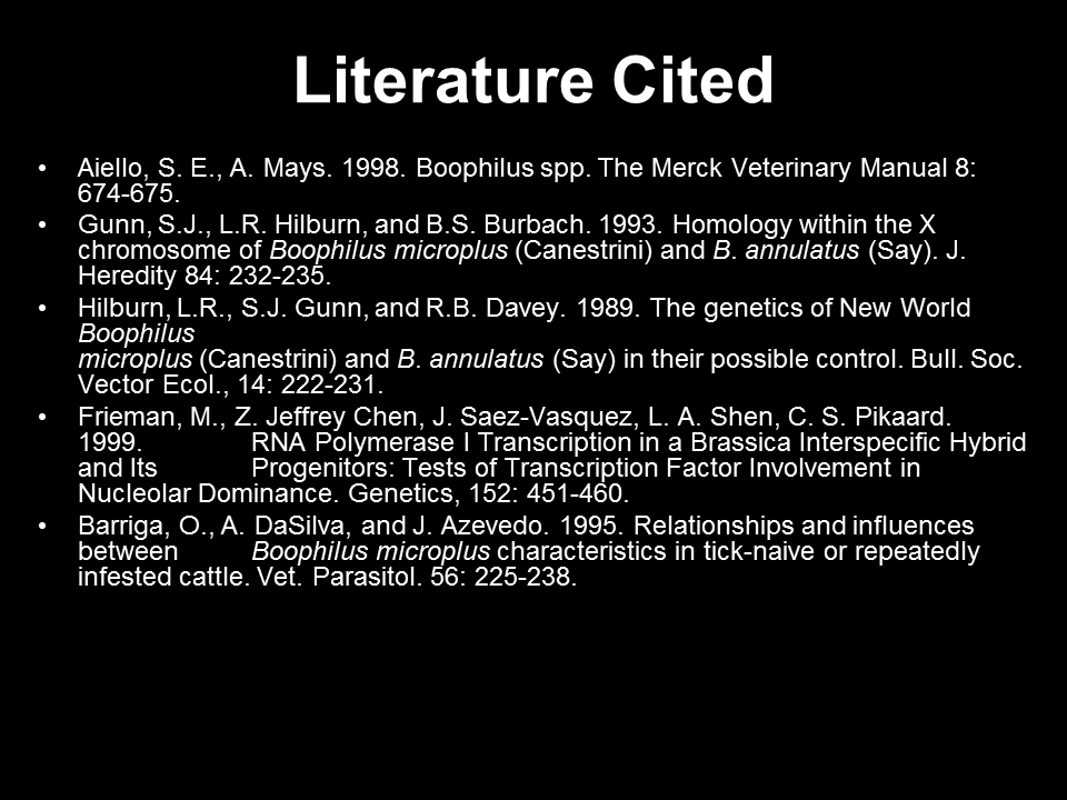
...so you can get to this one, end the presentation, and ask for questions. (Those are slides from an actual talk, incidentally.)
This is a horrible way to give references! Yet, I see this frequently. This is the wax fruit of academic citations: no matter what it looks like, you still can’t eat it. Academics are obsessed with citations because they allow other people to fact check. Giving references like this does not do the job.
You cannot put up slides this dense with text, flash them on the screen for less than a second, and expect anyone to get any usable information out of them. You could put in a list of Harlequin romances in the references and nobody would know.
There is no context for the references. In a paper, you can flip back and forth, so you can see that Simon et al. (2004) is given as supporting a particular claim about the infectious pathway of an organism, rather than providing information about the relevant statistical techniques. On slides, you can’t expect to remember that the reference to Simon et al. (2004) was on slide #3 that you put up twelve minutes ago, and that you shouldn’t confuse it with Simon et al. (2005) that was on slide #8, which made a totally different point.
If you want to give references in a talk, it needs to be:
Complete enough that someone can track it down, and
Given at the point of need.
In practice, this means you can’t just put “Simon et al. (2004)” and expect people to know what paper you’re talking about. Heck, I can’t even remember the year for some of my own papers. My suggestion is something concise, so a human being can quickly scribble a note. Something like:
Simon et al. 2004. Mol Biol Evol21: 1409.
Now, put it on the slide where you’re making the claim, not at the end.
There are advantages for you the presenter as well as to the audience. For a long time, I resisted putting references on my slides. I wanted to maximize the signal, and my strategy was to just say what the important sources were. Over time, however, I have often found myself going back to old slides without references, and going, “Argh, where did I find that? There was something else good on that site I want to us, and now I can’t find it!” Putting references on your slides will make it easier for you in the long run.