
 Edward Tufte's three previous books -- The Visual Display of Quantitative Information, Envisioning Information, and Visual Explantions -- were good purchases. They're the sort of book that I go back to again and again, sometimes just browsing through just to get a little inspiration.
Consequently, I looked forward to receiving Tufte's fourth major book on information design, Beautiful Evidence. There was something different about reading this book compared to the others, though. Tufte has posted several sections on his discussion board well in advance to get feedback on the ideas. I was one of the many "Kindly Contributors," as Tufte calls them, on those chapters, particularly one on phylogenetic trees. Further, one chapter had already been printed as a little booklet on PowerPoint. It so successful that it went to two editions.
Furthermore, a cursory glance reveals many examples that Tufte has already talked about at some length in his earlier three books. There's the works of Galileo. There is a whole chapter about Minard's chart of Napolean's march towards Moscow, which Tufte pretty much single-handedly made famous in The Visual Display of Quantitative Information, in which he said it might be the best statistical graph ever. High praise from a demanding taskmaster!
Given that a good chunk of the book was already familiar to me, was there anything new to be learned? Absolutely.
The first chapter concerns annotating pictures, which Tufte calls "mapped images." Right away, two of the books themes emerge. First, the importance of integration of different types of data. Here, pictures are the focus with the words providing supplemental information. Second, a concern is raised about dubious evidence, with the work of Ernst Mössel. Mössel tried to create a universal description of art, but ended up with a system that was so all encompassing that it could not be shown to be wrong.
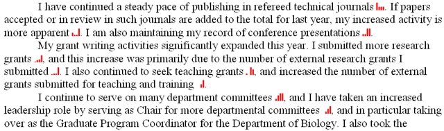
The second chapter continues on the theme of integrating information in Tufte's concept of sparklines. Sparklines are little mini graphs that are meant to be fully incorporated into text. To my disappointment, the HTML that would be required to stick a sparkline in the blog falls into the "more trouble than it's worth" category. But a few people are experimenting with these, and there are a few sparkline plug-ins for word processors that can be found on the web. I've used one of these in my own writing, though; shown here is something from one of my annual review documents.
It will be interesting to see if any high end technical journal will consider using these routinely.
The next chapter concerns using lines to link together. Tufte argues that most lines are underutilized, and could contain much more information and be much more useful than they usually are.
The fourth chapter is, to my mind, the heart of the book: "Words, numbers, images -- together." That statement is simple, but the many excellent examples make this a deep exploration of the idea. A chapter section on Galileo's work is wonderful. Every scientist knows Galileo's contributions, but seeing them through Tufte's words and pictures gave me a much deeper appreciation of the impact Galileo had. Tufte credits Galileo with a "forever idea," which, in a word, might be "empiricism." More to the theme of the book, however, Tufte uses Galileo's work to show how his arguments were enhanced by an integration of word and image. Again, this is an idea that Tufte has talked about before, that good displays put many comparisons in "eyespan," but the point is pushed farther in this book than before.
Similarly, the fifth chapter on Minard's chart is worth Tufte's revisit, as he uses it to exemplify powerful general principles we can learn about how to make "intense" displays that generate credible, powerful evidence. One simple example lesson from this chapter: sign your work. Credibility is enhanced by accountability.
Bad evidence, which had been introduced in the beginning, returns in force in the next two chapters, the second of which contains Tufte's already famous indictment of PowerPoint. Making a graph, Tufte argues, is an ethical act. Again, this is not a new idea for Tufte, since he introduced the "lie factor" in his first book. What is new is his argument that consuming such information is also an ethical act. Too often, we are lazy and don't hold liars accountable. These are powerful and important messages in an age of spin and truthiness. As I've said before, a lie left unchallenged gains the perception of truth.
The book's last chapter, on pedastals for sculptures, is the weakest and could have been omitted. It is disconnected from the rest of the book. The book, after all, is supposed to be about evidence. Nobody that I know of has ever claimed that scultural pedastals were ever intended or perceived to be evidence. Instead, the chapter showcases one of Tufte's other interests, outdoor abstract scultures. Still, Tufte's passion and thoughtfulness still shines, so much so that this deviant chapter is almost forgivable. Almost.
Similarly, I am puzzled by the choice of dust cover, which shows a series of pictures of one of Tufte's dogs leaping into a lake. Beautiful they may be, but are they evidence? If so, of what?
And I'll put out just one more thing that annoyed me in the text. In a few points, Tufte suggests that we ask ourselves, "What would Richard Feynman think?" I find this just as annoying as, "What would Jesus do?" I have no way of knowing how bright (Feynman) and profound (Jesus) people will respond to new and novel situations. Isn't this one of the reasons we find these people to be bright or profound? It's more useful to invoke their principles than trying to use imprecise empathy to figure out what to do. Particularly when I ask, "What have I done?" and see that I've approached the same problems in several different ways, often with equal success. In other words, when I see a bad graph, I think it's more useful to think of one of the many simple but deep ideas presented in Beautiful Evidence ("Show comparisons, contrasts, differences") instead of asking, "How would Tufte redesign this graph?" I could only really answer the latter question if I have buckets of money to try to hire Tufte as a consultant.
Finally, I am left wondering about cases where the evidence may be highly credible -- but is not beautiful. While working on this review, I was reading a scientific paper for my evolution class (Pellmyr, Olle & Leebens-Mack, James. 1999. Forty million years of mutualism: Evidence for Eocene origin of the yucca-yucca moth association. Proceedings of the National Academy of Sciences of the United States of America 96: 9178–9183; click here for abstract). The evidence is highly credible and believable, but I daresay that it is not beautiful. The argumentation is precise, but deadening. Tufte talks about ways that flawed evidence may be concealed (second hand repackaging: e.g., textbooks presenting summaries of technical papers that very few have read). But papers like this raise another way that flawed evidence might hide that Tufte does not discuss: "If it's incomprehensible, it must be brilliant." * People have become accustomed to research using techniques that are so new, few people understand them. Unintelligibility itself becomes an indication of credibility. That's bad. I think there's more to be said here, but perhaps that will be Tufte's book five, since the introduction promises he has more to say on the subject.
This book is, of course, going to be widely read and highly praised. But I don't think it will it be read enough. It is frustrating to read something like this advocating ethical scholarship and standards for evidence when there are new books that flat out lie about science (yeah, I'm looking at you, Ann Coulter). And when you can lie about science -- that part of human endeavor that Galileo transformed with his forever idea that it was all about evidence -- you can lie about anything.
To do your bit to kill truthiness, you could do much worse than following the principles in Beautiful Evidence.
* I call "If it's incomprehensible, it must be brilliant" the 2001 principle, because I think it explains why so many people sing praises to the movie 2001: A Space Odyssey. Many virtues it has, I admit, but the thing does not make sense.
No comments:
Post a Comment