

 When I lived in Montreal, I had the unusual experience of living in a city where a scientist was not just known (unusual enough), but frankly, revered. That scientist was Wilder Penfield.
I worked at McGill University, I worked on Dr. Wilder Penfield Avenue. And when I went to some talks at the Montreal Neurological Institute, I heard a speaker talk about having the chance to meet with "the great man," with no hint of irony.
Although it was probably Penfield's reputation as a surgeon that cemented him in the minds of Montrealers as a great individual, one of his most lasting scientific contributions is the map of the somatosensory cortex. This is truly a classic figure, that has been reproduced many times, and is virtually a standard in any textbook that even mentions brains.
Indeed, this picture has been used to study how textbooks copy from one another. In one redrawing of this diagram, a right hand got drawn onto the left side of a body (or vice versa). The error was then propagated in textbook after textbook.
I think this diagram comes from The Cerebral Cortex of Man: A Clinical Study of Localization of Function, co-authored with Ted Rasmussen and published in 1950.
The one up top shows half the story, namely the motor cortex. An equivalent diagram is available showing the sensory side.
What makes this figure a classic is that it uses images so successfully to tell the story. Wrapping the images of the highly distorted body takes something that is actually very abstract and makes it much more easy to relate to. If I am not mistaken, Penfield made these maps during open brain surgery, often with the patient awake. He would stimulate these regions, and observed what the patient did in response to the stimulation (on the motor side), or what the patient reported.
The diagram compiles all those observations of various body movements and miscellaneous reports of sensations.
 This edited version of the figure has all the same information as the top one, only using text labels. Indeed, the text labels on the top diagram are almost redundant. But it is clearly nowhere near as compelling as the one showing all the bits of body, with some regions enlarged and some shrunk.
Some people have gone the other way, and created representations of a body sized proportionately to the area of the brain that represents them. In my estimation, these are not as powerful, either.
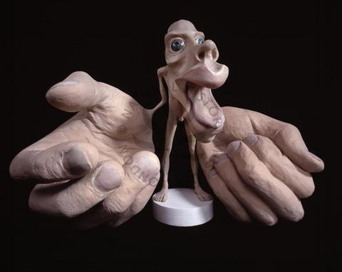 The distorted body (sometimes called a homunculus, which means little man) is now isolated from the brain. You lose that sense that this is something tied to how the brain works. Such representations have a certain interest, but I don't think they make the scientific point about how our body is represented in the brain anywhere near as well as the original.
Additional, 15 February 2015: Ran across this academic article describing how this diagram changed over time. The first effort, in 1937, was confusing compared to the famous 1950 version.
Schott GD. 1993. Penfield’s homunculus: a note on cerebral cartography. Journal of Neurology, Neurosurgery, and Psychiatry 56 329-333. http://jnnp.bmj.com/content/56/4/329.full.pdf
No comments:
Post a Comment