31 July 2020

Animal Behavior Society virtual meeting, Day 4

Today, I tried to see more cool science!

Unfortunately, one talk I thought was very cool began and I to blog about began with, “Please don’t share these results on social media.”

Mike Smotherman, who once was nice enough to host me at Texas A&M, had a very cool talk about bats using echolocation to detect texture. He suggests that bats’ auditory detection of texture is very like human touch detection of texture.

Susan Finkbeiner showed butterflies could distinguish different wavelengths of ultraviolet light. But only the females could do it! The males could not do this, because only females express two photoreceptors.

My colleague Kelly Weinersmith gave a great summary of her work on crypt keeper parasitoid wasps.  I’m just going to share this screenshot because it looks like she is kung fu fighting.

Kelly Weinersmith

Thienthanh Trinh presented some new work on the increasingly famous fungi that parasitise and manipulate ants. She showed a very cool maze she created to monitor the behaviour of infected ants, and was able to show infected ants wandered more, at all times of day, unlike uninfected ants, which had more of a daily rhythm and focused on food rewards.

My favourite title for a talk today was “Ants Dance Revolution,” and the presenter, Andrew Burchill, ran with that, and created a talk with lots of fun references and sound effects to Dance Dance Revolution.Andrew showed that you can do more with a video presentation than recording a narrated PowerPoint deck. The tank, however, was more about ant-mimicking spiders than ants. He showed that not only do spiders look like ants, they walk in the same weird patterns that some ants do.

I get the impression that there are more presentations about the underlying physiology of animal behavior than in past Animal Behavior Society meetings (but then, I don’t go every year). But there seemed to be much more endrocronology than neurobiology.

One thing that is similar in the virtual and face-to-face conferences: you start to lose track of all the stuff you saw very easily. It might be worse in a virtual conference because of interruptions and such unless you are closely tracking what you have seen in real time.

I did manage to get in to some more of the live Q&A sessions on Zoom. They are turning out to be very variable. Moderators need to make sure there are questions read for each speaker so there is no “dead air” waiting for questions to be typed into the chat box.

I also couldn’t help noticing people’s skill in camera placement. I saw lots of people’s ceilings. Some people, I couldn’t see all their face. Some people were so close I could practically see their skin pores.

Nice piece of news is that the Animal Behavior Society (US) and the Association for the Study of Animal Behaviour (UK) will be hosting a world-wide conference on Twitter in January 2021!

The talks are all up until the end of August, so I am hoping to catch up with a few more talks thatI didn’t catch in their scheduled time slot!

Related posts

Animal Behavior Society virtual meeting, Day 3

I didn’t want to mention this in my ABS Day 1 report, but the bookmarking for the conference is weird. I keep seeing bookmarked talks that I am almost certain I did not bookmark. I asked about this on Twitter, and I was not alone. This is frustrating.

A few observations as the meeting is wearing on.

The talks are 6 minutes long. That’s about half the length of a typical conference presentation, but frankly, I don’t miss the extra time. If anything, 6 minutes still feels too long. A lot of presentations would do well in a graphic abstract or poster format.

I’m finding it hard to get to all the talks I want before the Q&A session.


Screenshot from ABS Q&A session in Zoom

The Q&A sessions are moderated Zoom meetings. They go through each talk from a session in order, taking questions from the chat function. This is mixed. The interaction is pretty good, but if you haven’t seen all the talks in the session, or only have questions about one talk, there is a lot of filler for an audience member to sit through.

The meeting materials will be available until the end of August.

29 July 2020

Animal Behavior Society virtual meeting, Day 2 and Plant Biology 2020, Day 3

A particularly 2020 problem: attending two conferences simultaneously.

As I mentioned yesterday, I am attending the 2020 Animal Behaviour Society meeting. But some time ago, I also agreed to give a workshop talk about graphics at the 2020 Plant Biology meeting.

Get your message across workshop announcement

Now, my talk for Plant Biology was only supposed to be 12 minutes long, so easy to spend most of the day in Animal Behavior, dip in to the Plant Biology Zoom talk, give my presentation, and pop back to animals, right? Quart of an hour times commitment, right? Wrong!

First, I was still practicing my talk this morning. I decided I was going to give a short, snappy talk which was clocking in at 8 minutes instead of 12. But that meant I had to nail the delivery to get it done right. So the morning had no conference attendance.

Second, I had to show up early for my Plant Biology workshop and stay throughout. So the time spent there was not 12 minutes, but an hour and a half.

But the good news was that we have about 325 people in the Plant Biology workshop, with very little dropoff during the hour! As the last speaker, I was kind of worried about people drifting away. And the feedback for the workshop seemed quite positive.

So, I got to see Animal Behaviour talks in the afternoon, right? Wrong! In theory, I should have watched a bunch of talks, but in practice, yesterday and today were “interesting” days that dumped tasks and decisions on me that I did not anticipate would be happening at the start of the week.

Maybe I’ll get a chance to watch more talks tonight.

People talk about “conference fatique” and information overload with a single in person conference. Welcome to 2020, which says, “You want information?! Here, take two!”

External links

Animal Behavior Society virtual meeting, Day 1

A mix of old and new. The Animal Behavior Society (ABS) was the first scientific society I joined and the first scientific conference I attended. So I feel it’s appropriate that ABS is the first online conference I will be attending. And I’ve decided to do daily blog posts rather than tweet things, because I think it will be easier to create a coherent post from my desktop than it would be in a conference hall.

The first thing I want to talk about is also a mix of old and new. The virtual conference home page is new, because this is the first time they have done it, but the graphics?

Animal Behaviour Society virtual meeting landing page, with big "lobby" cartoon taking up most space

A very literal cartoon of a convention center. Not terribly high resolution. It kind of takes me back to 1990s Microsoft efforts like Microsoft Bob:

Microsoft Bob screenshot

It was a time when computers were becoming more common in homes, graphics were getting more sophisticated, and nobody was quite sure how people were going to interact with computers, so they interpreted everything as literally as possible.. Your calendar is shown as a calendar on a wall. Your desktop is a space on a cartoon desk.

I kind of thought we had moved past that. Most user interfaces are either more abstract and less literal (your decktop in Windows no longer has to be shown on top of a desk), or the interface is more graphically sophisticated (think of a 3-D video game environment; maybe Legend of Zelda).

Now, I suppose that for a first online conference, maybe that step back to a more literal convention center cartoon interface will help people. I don’t think it will be the sort of format you see for future conferences, though. We’ll see.

What else does the interface do? Well, there is a bookmarking function for talks you want to see. That’s good. But when you go get a list of your bookmarks, it doesn’t show when the events are. You have to click each entry individually, which defeats the purpose of bookmarking.

The times are all given in Eastern. There is a dropdown menu to change the time zone, but it doesn’t apply to all times. It will change a session time, but not the listed “Office hours,” which is confusing.

The format is that there are pre-recorded talks, live Q&A sessions, and “office hours.” You have to be really on the ball to watch the talks you’re interested in before the Q&A session starts! Hopefully, this is mainly a problem for the start of the meeting, and people can “get ahead” of the presentations before Q&A as the week goes on.

The live Q&A sessions are a little tricky, because all speakers for a session are there at once, each gets a tiny sliver of time, and questions are being taken using the chat function. So when a new speaker is on to take questions, there’s “dead air” when people start typing questions.

However, there is an asyncronous “ask a question” feature – a little like a bulletin board – which works very well. You can leave a question for the presenter, who gets an email with a notification, and then you get notified with a reply. So far, I have had 100% responses to my questions this way.

One nice thing I noticed was that recorded talks allow joint presentations. Just have people record their section, and edit together. Awesome. Nice way of showing teamwork and allowing multiple people to shine.

The system automatically logs you out after inactivity, and its not a very long delay before you’re kicked out.

But enough about the interface! What cool science did I see?

I saw some awesome talks updating me on a science story I have been following for some time: the evolution of Hawai’ian cricket populations that have lost the ability to sing. Some of those populations are evolving a new song, which is such a cool story of evolution in action.

Also saw some interesting talks related mostly to crustacean fighting.

To be honest, I didn’t see as many talks yesterday as I hoped, because yesterday turned out to be a much, much more interesting day that I expected, and I had stuff pulling me away from the computer.

That’s the biggest problem I’m finding: going to a meeting physically forces you to think about just that. An online meeting puts you in competition with the laundry, taking out the garbage, picking up mail, washing dishes, and all the innumerable little things that pull you away from the computer for a few minutes here and there.

External links

27 July 2020

Hanna aftermath

Hurricane Hanna

Hanna went through Saturday night / Sunday morning. From my perspective, it felt like the most substantial storm to hit the county since Dolly in 2008.

We lost power Saturday night and didn’t get it back until early Sunday.

No flooding where we were, though the rain caused some leaks and a little water damage that needs fixing.

And the air conditioner got broken and needed repair.

But all up, fared reasonably well. One preparation tip: download at least one movie to your portable electronic device before the hurricane. Sunday would have been much more tolerable if there was even one thing from Netflix or Amazon Prime or Vudu or something on my iPad.

Of course, personal inconvenience is not the biggest problem. I’m now waiting to see how the COVID-19 cases are going to track out a couple of weeks down the road. Hanna might have made more people shelter in place and reduce cases, or it might mean more people were stuck inside with each other and increase cases. We’ll see.

Update, 28 July 2020: Whoa. I had not gone around the corner to the back of the yard.

Tree snapped by Hurricane Hanna

More damage that I thought at first. That tree is down for the count.

I also had one strange, sad thought. Three years ago, I suspended data collection on a field project that had been running for several years. There was a point where, weirdly, Hanna would have provided an research opportunity. I could have seen the “before” and “after” effect of Hanna on the population of sand crabs out as South Padre Island. Could have been a paper in that alone.

But the project got suspended end of 2017. But even if I hadn’t stopped it then, I might have stopped it this year with COVID-19. I have been trying hard to stay put and I don’t want to go to the beach since they have reopened them, nobody is wearing masks, and there doesn’t seem to be a lot of social distancing,

25 July 2020

Notes from a pandemic: Holy Hanna, it’s bad

Weather Network landing page with "Breaking news: CONDITIONS DETERIORATING"

I’ve never felt a headline so strongly. It is the current landing page on The Weather Channel, yet somehow, it feels like it’s just an apt description of... [flails hands around pointing randomly]  everything.

“Conditions deteriorating.”

You said it, Weather Channel. You said it.

So we not only have a major outbreak locally in the global COVID-19 pandemic, and fascism and white supremacy on the rise, we now have a hurricane – Hanna – heading our way on top of that.

That’s just fuckin’ ducky.

So where are we on the COVID-19 situation? Well, it’s been so bad locally, here in the lower Rio Grande Valley, that it has on the national news repeatedly, and sometimes breaking out to international news.

For me, it’s the traffic that tells the story.

Back in late March, early April, when I went out to the university to do animal care or pick up groceries, the roads were almost empty. People were staying at home because of the COVID-19 pandemic.

Now, despite more cases and more deaths than ever, and the region being in national and international news, the amount of traffic on the road is around what it was before mid-March. People are not staying home.

The small piece of good news is that I haven’t seen any signs of people not wearing masks or being pissy about it. When I go out (which isn’t a lot), I see everyone masked. The problem people who can’t seem to wear a mask properly (it needs to cover your nose) or pull them down to talk to other people or some other reason.

The other comment I have is that in watching a lot of news coverage, it sometimes drifts towards a “blame the victim” feel. Lots of articles have commented on the Valley having lots of Hispanic / Latinx / Mexican people, and several articles have sort of pointed towards the “culture” as being one of the major drivers for the COVID-19 cases here.

I think there is much more to be said about the long, historic lack of resources in the area at the state level. Although I’ve been pleased that that has turned around in the time I’ve been here – notably the creation of my own university, UTRGV – that hasn’t been completely fixed.

And there is a long-standing health care issue here. Back in 2009, Atul Gawande wrote about the crazy high healthcare costs in McAllen. Back then, Gawande wrote:

She wasn’t the only person to mention Renaissance. It is the newest hospital in the area. It is physician-owned. And it has a reputation (which it disclaims) for aggressively recruiting high-volume physicians to become investors and send patients there. Physicians who do so receive not only their fee for whatever service they provide but also a percentage of the hospital’s profits from the tests, surgery, or other care patients are given. (In 2007, its profits totalled thirty-four million dollars.)

While some things did change in the years since (follow-ups: 2009, 2015, 2019), Renaissance (a.k.a. DHR) is still a physician owned hospital, and this same hospital has been the subject of much scrutiny, as I noted earlier this week.

I also think there is a lot to be said about state leadership. This hasn’t been ignored, but if I had to rank the reasons for an outbreak in the Valley, I reckon decisions made by Governor Greg Abbott contributed way more than family get-togethers. But the coverage I’ve been seeing about the Valley seems to give the two equal weight.

21 July 2020

Facebook is a superspreader of COVID-19 misinformation

Sources of misinformation have been a lot on my mind. And a new study shows one that I’ve not written enough about: Facebook.

Sure, I’ve written about recommendation algorithms being a problem, but I was thinking more about YouTube, which is a bigger platform than Facebook.

But an analysis of data here shows just how shocking Facebook is at squelching crazy COVID-19 rumours.

Graph showing origin of COVID-19 misinformation, with Facebook way out in front
Facebook spreads more wrong stories than all the others combined.

Update, 27 July 2020: Amy Maxmen points out anti-mask groups are also doing well on Facebook.

Related posts

External links

20 July 2020

Notes from a pandemic: Local hospital blasted for poor conditions

On Twitter, Nurse @shesinscrubs has started tweeting reports from local hospital, DHR.

It’s bad. Like, extremely bad. Like, horrible. I’ve compiled her first, main thread below (courtesy Spooler). It doesn’t capture everything in her thread, but it gets a lot.

My university has had a lot of ties with DHR. Here’s an internal medicine residency at DHR. Here’s a general surgery residency at DHR. Family medicine residency. Obstetrics and gynecology.

I would argue that these arrangements should be reviewed soon in light of these revelations.

• • • • •

This thread will be about the abhorrent conditions at the covid "hospital" DHR put up in McAllenTexas. Staff have walked out of this facility because of the conditions in which there are literally ants crawling over critically ill patients. Hiding PPE from staff. DHR is putting covid patients in this inadequate facility because they want the fully functioning hospital across the street to remain “clean.”

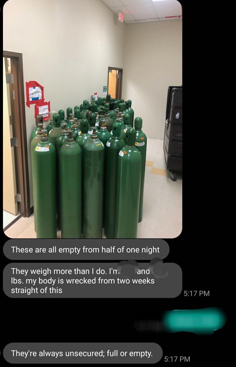
TW: Patients in abhorrent conditions. Patients placed in cramped rooms without adequate ventilation or air conditioning and full of medical equipment. Oxygen in the facility stopped working on July 5th, staff has been forced to using portable tanks for patients.
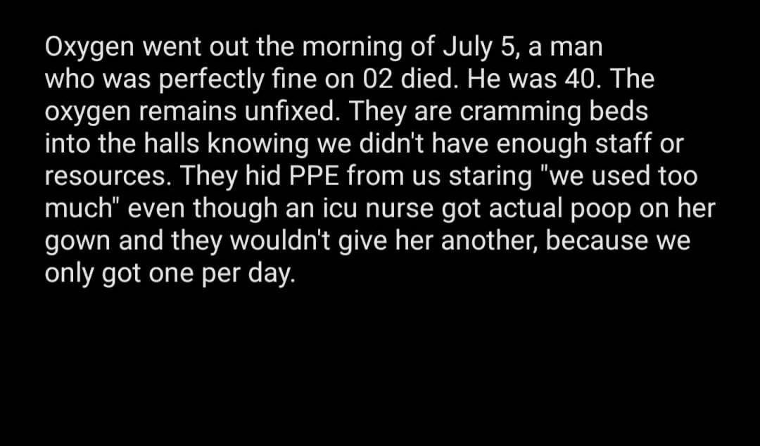
For reference these tanka last 45 minutes when run at 100% FiO2 and they only had 3 people to change them out for 90 patients.
Trigger Warning⚠️ Blood/Medical Equipment/Critically ill patient.

The black dots on the patients back and on the bed are live ants crawling all over them. This is unacceptable.

This is absolutely horrific.
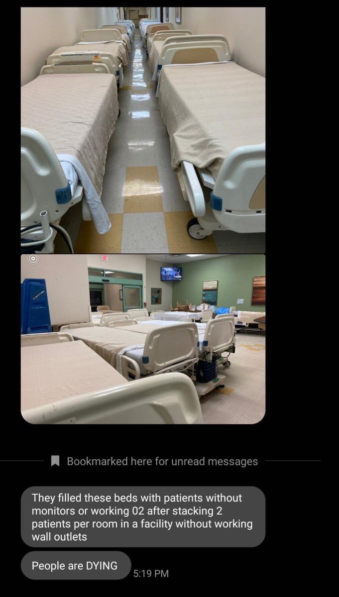
Doctor’s Hospital Renaissance converted a hospice facility into a covid unit. The thread above exposes the abhorrent conditions that was not covered in this article. (texastribune.org/2020/07/02/tex…) The nurses and respiratory therapists are being threatened into silence. The hospice facility was converted into a COVID unit so that DHR would stay “clean”
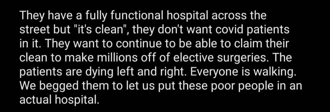
I do not work at this facility. I am assisting in blowing the whistle on the conditions of this facility. Those who work at this facility have been threatened into silence. To clarify this is who “Krucial” is, a staffing agency that has been staffing surge cities.

”Race-Based disparities in health outcomes are not abstract” Texas is failing their Latinx community covered DHR in an article today and here they talk about what my contact told me, the main hospital has been “kept largely free of the coronavirus to treat patients unrelated to the pandemic....as well as some elected procedures”
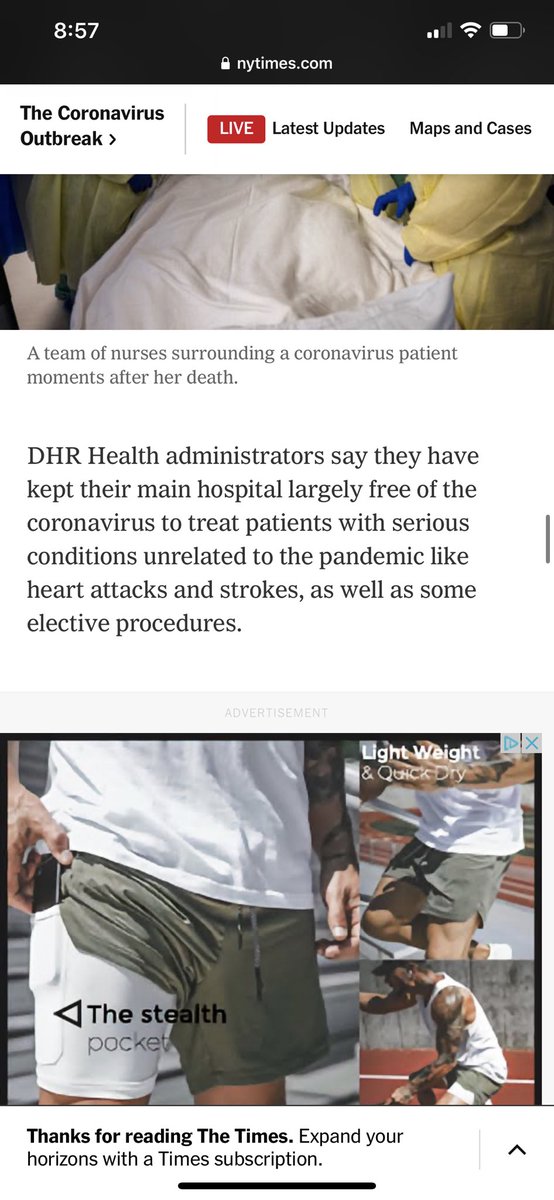
From a Nurse at DHR in McAllen, Texas.
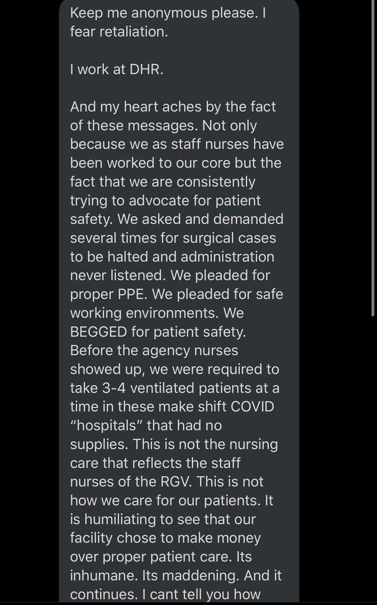
More nurses confirming this story.
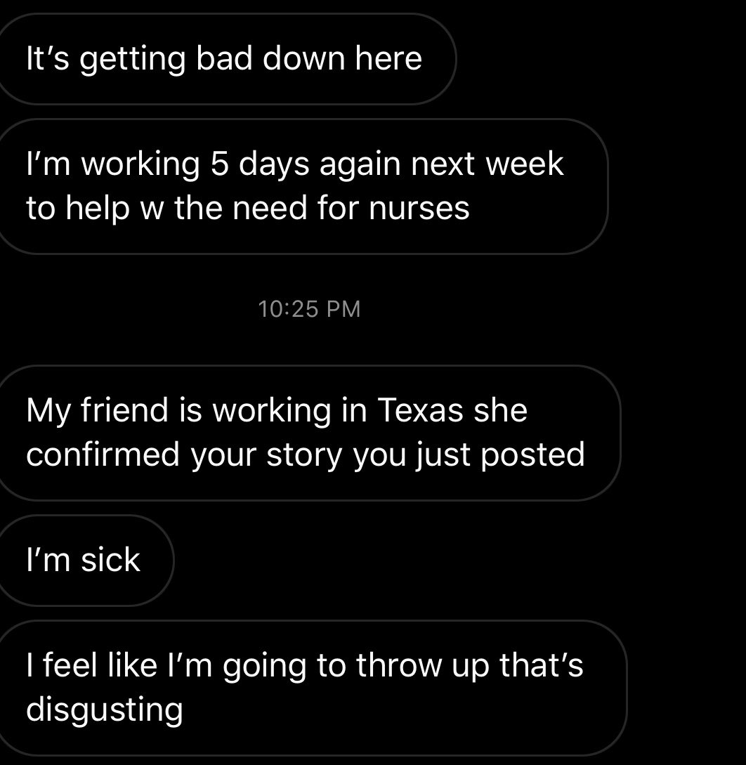
Covid is not profitable. Cutting corners in order to allow for continued elective procedures is profitable.

A newly hired nurse who was basically fired for testing positive for covid because she couldn’t use her PTO as sick leave.

“Rubrics are good” and other things some professors do not believe

Man, moving to online instruction en masse because of COVID-19 has been a trip. Partly because I’m getting exposed to people’s attitudes about teaching in a way I didn’t expect.

To teach entirely online, our university has been requiring training in online instruction from an outside company. I did this, because I moved to teaching more online a couple of years ago. I wanted more time to work on the Better Posters book, and there was demand for core courses online that were hard to meet with face-to-face classes.

Since COVID-19 gave more people incentive to teach online, more people had to do the training. And wow, are they ever pissy about it. I’ve listened to people complain about:

Rubric icon
Having to create rubrics for assignments
. “I don’t want to have to spell out everything, I want the students to do something more freely.” If students are going to be evaluated, you must have some idea on what basis you’re going to evaluate them, and they deserve to be told what that basis is. It also will save you time in grading and make grading more consistent.

Not having “understanding” as a learning objective. “I think it’s important that students understand the content.” Y’all need B.F. Skinner. Internal states are not knowable directly. How are you going to tell if students understand something? You are going to ask them to do something observable, like write or talk or create something. So make it your objective that the student be able to do something, not reach some internal state that they are probably ill-equipped to judge. Lots of professors have heard, “Oh yeah, I get it, I understand” from students who tank the exam the next day.

Not wanting to provide accessible content. “Why do we have to do all this work when we might not have any student who needs it?” and “It’s not our job to close caption videos” This is perhaps the complaint that frustrates me the most. Because first of all, accessibility is the law.

Second, making something accessible, by providing something like closed captions, makes the content better for everyone. It lets someone watch a video when they maybe don’t want to play the sound out loud and don’t have headphones. It makes hard to hear sentences and spellings explicit.

I am in a weird profession where people whinge so much about wanting to do things their way and no other way even when it is demonstrably a good thing to do.

13 July 2020

Who am I citing?

There is research that indicates that women scholars are cited less than men. There is research that indicates that Black and brown scholars are cited less than white ones. So I see, and am sympathetic to, calls for people to check who they are citing. Citing only white guys perhaps means you are not capturing the full range of scholarship that exists.

This is harder than it sounds.

Star Trek title card showing "Written by D.C. Fontana" (The "D" was for "Dorothy".)
Some authors want to obscure their gender or background, sometimes to reduce bias. So they use only their initials.

Some journals show only author initials, particularly in the references.

Some names are used by both genders. Names like Terry, Kelly, Zen...

Once you get past your own language and culture, trying to work out gender from the name alone becomes much more difficult. I wonder how well most English speakers would do at guessing the gender associated with Chinese or Indian names.

So when someone asks, “What percent of your reference list in your papers are white men?”, my answer is, “I don’t know.”

I am not sure what the solution here is.

In theory, this kind of demographic data might be registered by ORCID. Eventually, I could imagine a system where you downloaded ORCID into a citation manager, which could then do an analysis on a reference list. Or you could have a plug-in or webpage that did that. But ORCID currently doesn’t capture anything like that. I don’t think any academic database does.

Otherwise, the only answer I can think of is doing a lot of googling, which will probably not lead to definitive answers in many cases.

Update, 14 June 2020: Thanks for Beth Lapour for alerting me to this work. This paper tries to examine citation bias in neuroscience journals. Excerpt from the abstract:

Using data from five top neuroscience journals, we find that reference lists tend to include more papers with men as first and last author than would be expected if gender were unrelated to referencing. Importantly, we show that this imbalance is driven largely by the citation practices of men and is increasing over time as the field diversifies.

They used a couple of automated techniques to try to distinguish gender of the authors. Using two databases, they assigned an author as male or female if their confidence was 70% or better. One was an R stats package. I seem to recall reading criticisms of this package on Twitter, but can’t find it now.

They failed to assign gender for 12% of authors: 7% because there wasn’t high enough confidence by their criteria, and 5% because no author name was available for the paper. I’m not sure what the latter group could be. Unsigned editorials, maybe?

They then tried to find an independent way to check the accuracy for the 88% of authors they assigned a gender. They did this by sampling 200 authors and Google stalking them for pronoun use. And according to that, their algorithmic assignment was about 96% accurate.

So according to this, the problem is currently small. But this is just a snapshot of one field. I wonder if the difficulty will get larger or smaller over time for reasons mentioned in the main post.

Update, 28 July 2020: Marie Rivas articulates some of the reasons I am uncomfortable with using software to assess gender for research purposes: 

1. You cannot “identify” or “verify” gender on behalf of someone else; you can only guess.
2. Guessing gender is often inaccurate, offensive, and exceptionally harmful.
3. You don’t actually need to know peoples’ genders for most use cases; and if you really must know, just ask.

Reference

Jordan D. Dworkin JD, Linn KA, Teich EG, Zurn P, Shinohara RT, Bassett DS. 2020. The extent and drivers of gender imbalance in neuroscience reference lists. Nature Neuroscience: in press. https://doi.org/10.1038/s41593-020-0658-y

08 July 2020

Update on the Better Posters book

Better Posters book coverThe Better Posters book is inching closer to reality!

The book now has a:


Most of the discussion about the content book will be over at the Better Posters blog, although I will occasionally talk about about the creation and backstory of the book here.

My only disappointment is that the ISBN is not a prime number. Divisible by 379. Damnit.


07 July 2020

Notes from a pandemic: You go into lockdown with the data you have, not the data you want

The Better Posters book is still in press. I am getting periodic updates from the publisher, which is exciting.

I am waiting on reviews for one project.

I am writing another big project, and I have many thousands of words down for it already.

So these are good. But I have no idea when I will be able to collect data again, and it’s kind of getting to me sometimes.

I was preparing for a journal club presentation about snapping shrimp. Which are awesome beasts. They make sound louder than a gunshot, louder than a rocket launch, with their claws. The journal club talk isn’t even about claws, but I wanted to mention how they worked because it’s tangentially relevant to the main part of the talk.

I came across this paper about the evolution of the snap. It’s comparative, got behaviour, 3-D modelling of the claws, biomechanics, a lot of the kind of stuff I was doing more back in grad school. It’s amazing work.

And I feel sad. I want to do stuff like it. I want to do good, original science.

06 July 2020

The long reach of old media: Fox News and COVID-19

I can’t stop thinking about this Washington Post article from last week.

Three serious research efforts have put numerical weight — yes, data-driven evidence — behind what many suspected all along: Americans who relied on Fox News, or similar right-wing sources, were duped as the coronavirus began its deadly spread.
Dangerously duped. ...
Those who relied on Fox or, say, radio personality Rush Limbaugh, came to believe that vitamin C was a possible remedy, that the Chinese government created the virus in a lab, and that government health agencies were exaggerating the dangers in the hopes of damaging Trump politically, a survey showed.

This has just been rolling around in my gut for days. People keep asking, “How did wearing a mask become political?” This is how.

While I still think recommendation algorithms are a huge problem for science communication, this article is a reminder of two things.

The first reminder is that while new media are influencing the information spread in ways that nobody can predict, established, pre-Internet media still exerts a huge influence on how people think about issues and problems.

In times of crisis, you need consistent and pervasive messages about what people need to to do to protect themselves and others. This is why the US Center for Disease Control keeps getting shit for: because they were slow to recommend masks. But I don’t think that is even slightly comparable to the Fox News situation. If the CDC messaging created a chink if the armor, Fox News messaging stripped off the armor and went dancing naked and blindfolded through a minefield.

The second reminder is that Fox News has a lot to answer for. The damage it has done to the United States is almost incalculable. And I am not just talking about the COVID-19 pandemic.

External links


Related posts

04 July 2020

Letter about a statue

This was a letter I set to my university president, Guy Bailey, last month. I’m posting it today because I think in the US, 4 July is a good day to have serious discussions about history.

I was also motivated by listening to “Return of Oñate’s Foot” on the 99% Invisible podcast – an excellent telling of a story about a somewhat similar historical figure.


Hello,

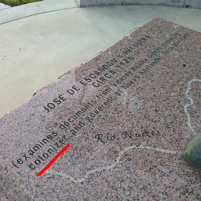
I was pleased that you addressed issues of racism in your email of 2 June. I wanted to bring up an related item for your consideration: the statue of José de Escandón on Edinburg campus. The statue describes Escandón as a “colonizer.” I suggest you consider whether a statue of a “colonizer” is in line with UTRGV’s values.

Base of status to Jose de Escandon describing him as a colonizer

In particular, Escandón’s professional climb that led to his mandate to colonize the region was in part based on his success in quelling uprisings of Native Americans and “pacifying” them. That alone is problematic, particularly for our Native American students (5-11 students over the last four years). but also consider the larger role of colonialism in perpetrating slavery and genocide.

Other universities are taking this moment to examine and change the symbols that represent racism and colonialism. Imperial College London changed its logo to remove its motto. They recognized their motto, “Scientific knowledge, the crowning glory and the safeguard of the empire” is “is a reminder of a historical legacy that is rooted in colonial power and oppression.”

Over the last few weeks, many communities worldwide have been re-examining their statues and the messages they send. Protestors pulled down a statue of a slave trader in England. McGill University students are petitioning to remove a statue of university founder James McGill, who owned slaves.

Statues glorify individuals and values. I hope that you will consider whether this statue represents values that UTRGV supports.

01 July 2020

Canada Day 2020

Alpha Flight's Guardian

The current landing page for the Contest of Champions mobile game makes me happy.

The character shown is Guardian, leader of Alpha Flight.

Happy Canada Day!