I use a reference manager (currently, EndNote X5). A lot. And while importing a bunch of articles over the weekend, I got frustrated playing hunt and click trying to find the button to put a reference into my reference manager.
For one thing, there’s not consistency in what the websites are asking you to do. Half think you want to “export” the citation, and the other half think you want to “download” the citation. It’s split right down the middle.
Here is the result of my comparative study so far. First, I like ScienceDirect: it puts the button in the first place you look, up in the upper left, following the Cosmo principle.
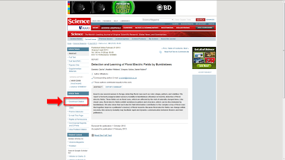
Science doesn’t put it at the top, but it’s on the left.
Nature does the same, though not in a sidebar.
But... not all journals from Nature Publishing Group follow the same layout and format as the flagship. This is odd.
One of the other big publishers, Wiley, puts the button halfway down on the right hand side.
Middle right is probably the most common location for the export citation buttons, exemplified by another one of the big academic publishers, Springer. (By the way, Springer, when will be be able to export the article abstract along with the citation again?)
The Royal Society journals (which has one of the most explicitly described links)...
...Brill...
... and BioOne.
Even JoVE puts their export citation link, though the link is way down the page and may be offscreen in some views.
Very few journal websites put their link in the bottom middle of the page. Inter-Research is one.
Taylor & Francis is another.
Now things get a bit more tricky.
BMC journals drive me bonkers. Every other publisher calls the thing you are saving a “citation.” BMC alone calls them “references.” I can’t count the number of times I’ve started blankly at a BMC article, trying to figure out what to click (“I don’t want the references in this article, I want this article!”), until I remember this.
PLOS journals recently redesigned their websites, and in doing so, hid the citation button and asks for multiple clicks to get to it. First, you have to click “Download.”
Only then do you see an option for the citation. For the same screen real estate, PLOS could show three buttons, making it easier to find and saving us a click.
PNAS is one of the other websites that makes me crazy every time I want to save a citation. They have their link in the industry standard location, in the right margin. When I click...
... I get a drop down menu. A drop down menu with only one choice. Why are you making me click again?! You’re not giving me a choice, so just let me get the citation already! Life is a finite number of mouse clicks, and I don’t want to use any more of them than I have to!
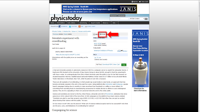
Physics Today not only follows PLOS and PNAS in making you click multiple times, it is more cryptic, hiding the link under the mysteriously named “Tools.”
Clicking “Tools” then give you options, including citation export.
The “Hall of shame” award in this category, however, goes to JSTOR. JStor’s page doesn’t look so bad, with the link in the right side.
It gets the raspberry because you can only see the “Export citation” link if you have an institutional login. Seriously?! Is a citation so valuable that it must be password protected? For crying out loud, every other publisher gives you the ability to export the basic bibliographic information for free. For shame, JStor! Shame on you!


3 comments:
So why not use Mendeley where you can just click the Import to Mendeley bookmark on the Pubmed page? ;)
Also easy to import Endnote refs and have a watched folder for all .pdfs (for which it automatically grabs the citation data).
Zotero, people. It is sooo easy to use!
Post a Comment